June 15, 2025
2025 SEO Trends: What You Need to Know
Discover the key SEO trends that will dominate 2025 and how to prepare your website for success.
Read MoreHow strategic color choices can influence user behavior and improve conversion rates.
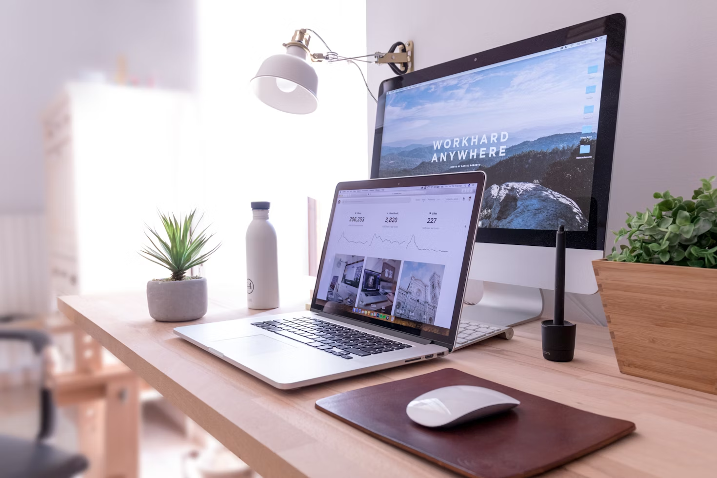
Color is one of the most powerful tools in a web designer's arsenal. Beyond aesthetics, colors communicate meaning, evoke emotions, and significantly impact user behavior. Understanding color psychology can help you create websites that not only look beautiful but also drive conversions and enhance user experience.
Strategic color use can increase conversions by up to 24%
In this comprehensive guide, we'll explore how different colors affect user perception, share real-world case studies, and provide actionable strategies for implementing color psychology in your web design projects.
Color psychology examines how colors affect human behavior and decision-making. Studies show that up to 90% of snap judgments about products can be based on color alone.
Research from the University of Winnipeg found that color increases brand recognition by up to 80% and can improve readership by 40% and comprehension by 73%.
Three primary ways color influences users:
Different colors evoke different psychological responses. Here's a breakdown of major colors and their web design applications:
Evokes trust, security, and stability. Ideal for finance, healthcare, and tech companies. Facebook, LinkedIn, and PayPal use blue as their primary color.
Creates urgency and excitement. Increases heart rate. Effective for clearance sales and food brands. Used by Netflix, CNN, and YouTube.
Associated with nature, growth, and harmony. Often used for environmental, health, and wellness brands. Starbucks and Whole Foods use green prominently.
Represents optimism and youthfulness. Grabs attention but can cause eye strain. Best used sparingly for highlights. Snapchat and McDonald's use yellow effectively.
Symbolizes luxury, creativity, and wisdom. Often used for beauty and anti-aging products. Yahoo and Hallmark use purple in their branding.
Strategic color use can significantly impact conversion rates. Here's how leading companies leverage color psychology:

When HubSpot tested green vs. red CTA buttons for their marketing software, they discovered that the red button outperformed the green one by 21%. This challenges the common assumption that green is always the best color for conversion buttons.
Key takeaways for CRO:
A well-designed color palette creates visual harmony while guiding users' attention to key elements.
Try creating your own palette to see how colors work together:
Professional palette guidelines:
Colors carry different meanings across cultures, which is crucial for global brands.

Color meanings vary significantly across different cultures
Notable cultural differences:
When Airbnb expanded to China, they changed their signature "Belong Anywhere" red to a softer peach color, as bright red can appear aggressive in Chinese design aesthetics.

Discover the key SEO trends that will dominate 2025 and how to prepare your website for success.
Read More
How strategic color choices can influence user behavior and improve conversion rates.
Read More
Proven strategies to optimize your social media advertising budget and increase conversions.
Read More